THE SUMMARY
Created by friends and coffee lovers, Cre8ive Coffees required a logo designed for their new venture; a place where they could connect coffee roasters and connoisseurs. Using the brief supplied, we set out to create a logo that reflects this desired connection and appeals to all coffee lovers.
The colour palette used for both concepts are inspired by the various hues of the coffee bean during the harvesting process right through to the drying and roasting process.
The typeface used for both concepts is a clean sans serif, chosen for it’s legibility. The letters are constructed in a way that allows for gaps and has spacing where the letters join, this provides interest and speaks to the space needed for connections to happen.
WHAT WE DELIVERED
- Logo Design
The first concept was created with rounded, clean lines to resemble a modern version of a vintage stamp. The coffee bean and cup icons can be used to create a circular ring which can be used as a branding device.


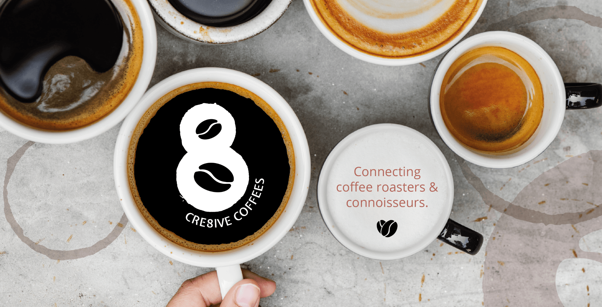
The second logo concept references the ‘hands-on’, ‘hand roasted‘ concept of small batch coffee. Using the textured edges a coffee rim stain often leaves behind, gives the logo an artisan look and feel. Two coffee beans have been incorporated with the aerial view of two cups of coffee to create the number 8, from ‘cre8ive’. The cups of coffee join to form the ‘8‘ and also symbolise the ‘connection‘ between coffee roasters & connoisseurs.


